Wednesday, January 18, 2012
Sunday, January 15, 2012
What I have collected from Rapid Penang :)
Sunday, January 8, 2012
Web Design 2 Project - Rapid Penang
Gantt Chart :
Client's website analysis:
 |
| http://www.rapidpg.com.my/ |
Good:
-nice graphic of the rapid bus
-many data provided
-consistent on the mood
-side navigation and the logo is consistent at the left side
-background will change according to the daytime or nighttime
-side navigation and the logo is consistent at the left side
-background will change according to the daytime or nighttime
Bad:
-home page a bit complicated
-same layout for every page seems a bit boring
-side navigation can be better
-side navigation roll over a bit too fast, hard to click on it
4 Competitors Website
http://www.panoramalangkawi.com/
Good:
-Nice visual on the navigation links above.
-Bottom of the page looks nice.
-Identity color is green.
Bad:
-Top navigation link and side navigation link are the same.
-Images not interesting enough to grab attention, a bit boring.
-Typography for the navigation link above can be better.
http://www.ktmkomuter.com.my/
Good:
-Neat information provided.
-There are many visual supported in this web.
Bad:
-Pink and green appeared in home page a bit not match.
-Overall website can be more attractive.
-After scrolling down, the navigation above(homepage) seems a bit like just for decoration and people wont go and click it as there are same navigation link at below there to easily click.
http://www.sbstransit.com.sg/
Good:
-Identity color, purple is used.
-Top navigation links are consistent.
Bad:
-Home page too many words, a bit packed.
-Small navigation link. Can be bigger ad it can be easier to click
-Too little visual to attract people to continue reading.
https://www.aeroline.com.my/
Good:
-Identity color, yellow is consistent.
-Bottom image on the homepage is nice, have a good concept that link.
-Clear information given.
Bad:
-Navigation links a bit too small.
4 Beautiful Commercial Website
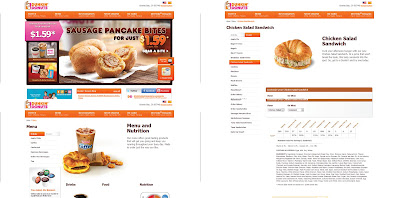
http://www.dunkindonuts.com/content/dunkindonuts/en.html
Good:
-Identity color,orange is consistent.
-Big image on homepage grabs attention.
-Interesting layout.
-Nutrition facts part is creative, I like.
-Main navigation links on top is consistent.
Bad:
-Too many white space on some page.
-Top navigation link roll over effect overlap with the info data look bad.
http://www.fridays.com.my/index.php
Good:
-Identitry color, red is consistent.
-A bit packed on the homepage but it looks great in this layout.
-Neat and tidy website.
-Have great layout on the menu part. It's clear enough.
-Top and side navigation link is consistent.
-Attractive and big advertisement that can grab attention easily.
Bad:
-Typography for navigation links can be better.
-Roll over sound effect just appeared at homepage and not all pages. Not consistent.
http://www.solvilettitus.com/
Good:
-Nice color mood. Smooth and warm.
-Nice layout on the product page. Using white but I can feel the elegance.
-Color used is super match with all the product. Looks nice.
-Fonts is suitable for it too.
-Clear information given.
-Like the photo gallery.
http://www.chanel.com/
Good:
-Overall is in black. Elegance and grand.
-Big image in the homepage to grab attention.
-Like the layout by introducing the product 1by1 that spend lots of space but great layout it have.
-Nice interactive on clicking it. Nice movement for every "next".
-Loading part on top of the page is creative.
__
http://metrochicago.com/
Good:
-the layout is great, neat and clear
-the color and composition is fashionable, won't look updated
-typefaces is match, it looks nice on the navigation links and even the body text
-nice typography on the overall website
-logo and navigation link align at right look fresh
-love the color mood
Bad:
-different layout on other pages will be better
________________________________________
4 HTML Coding Tutorial
-http://www.2createawebsite.com/build/html.html#dropdown
-http://www.ssi-developer.net/css/menu-rollover-effect.shtml
-http://www.addglitter.com/hover-link-glitter.asp
-http://www.quackit.com/html/codes/html_marquee_code.cfm
4 Design Tutorial
-http://www.noupe.com/tutorial/53-killer-photoshop-illustrator-effects-and-tutorials.html
-http://www.1stwebdesigner.com/tutorials/50-really-high-quality-photoshop-navigation-menu-tutorials/
-http://sixrevisions.com/photoshop/25-web-design-layout-tutorials/
-http://slodive.com/photoshop/photoshop-web-design-tutorials/
Subscribe to:
Comments (Atom)


